top of page

Spiritato
Packaging
The brand identity was developed around the idea of “spirit” as both essence and character. Its name, derived from the Italian word spiritato, meaning “full of spirit,” captures the energy, personality, and craftsmanship behind the product while establishing a subtle connection to its Mediterranean influences.
The visual language embraces elegance and simplicity, reflecting the gin’s silky character and premium positioning. Every element of the identity was designed to communicate a sense of purity, sophistication, and authenticity, creating a brand that feels both timeless and contemporary.
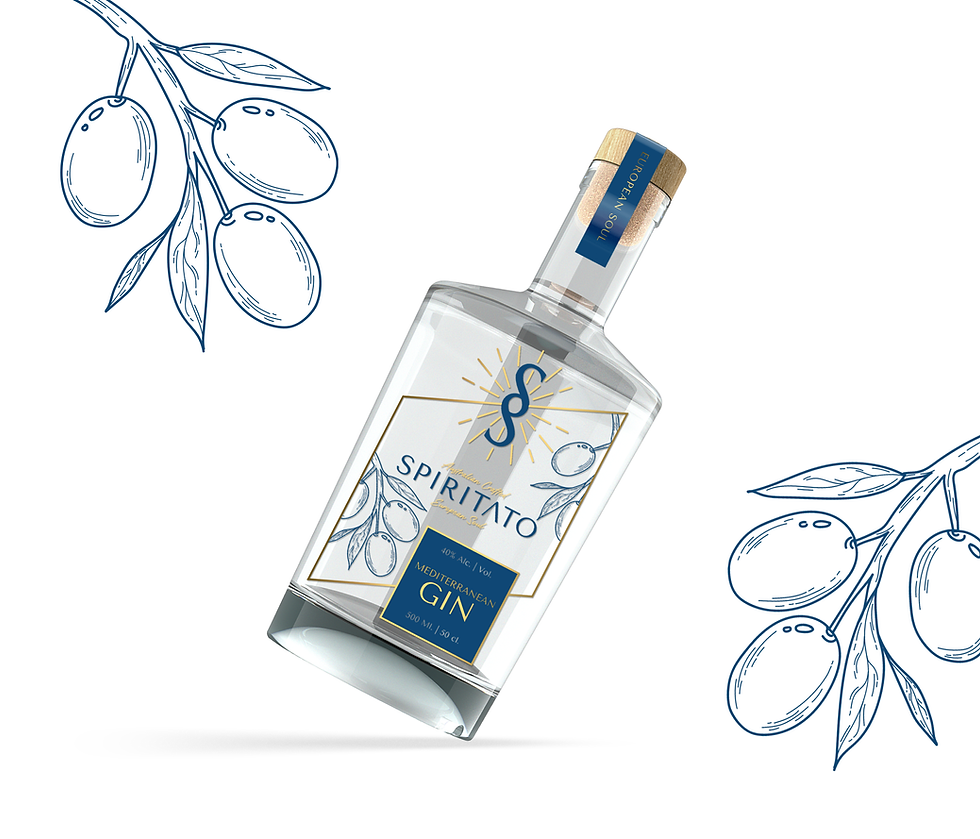

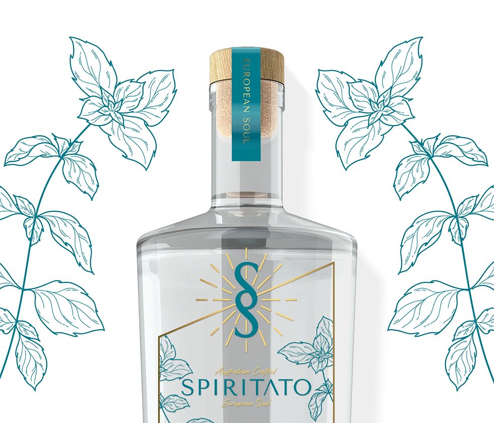
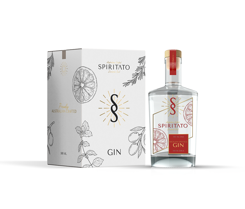


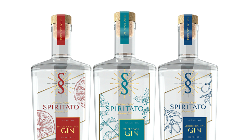
Crafted from pristine spring water and a carefully selected combination of local botanicals and Mediterranean ingredients, the spirit brings together two distinct landscapes and traditions in a refined and contemporary expression
bottom of page