top of page

Goldilock
Branding
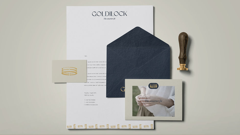
We developed a monogram-inspired symbol built around the silhouette of three interlocking rings, representing progression, balance, and calibrated fit.
The mark uses negative space to subtly reference both the brand name and the Goldilocks principle—the idea of finding the solution that is “just right”: neither too tight nor too loose. Its three distinct states represent the process of adjusting and selecting the perfect fit, while the overall composition suggests a “G” in motion, reinforcing the ideas of adaptability and transformation.






Goldilock is an adjustable ring designed for a personalized, comfortable fit. Its innovative mechanism opens over the knuckle and locks securely into three positions, adapting seamlessly to different finger sizes.
bottom of page