top of page

Synergist
Branding

An agency built around ideas, connections and progress
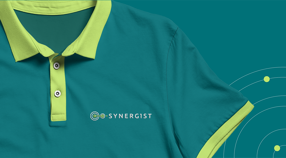
The visual system centers on a precise, abstract isotype: two linked circular forms joined by a single line, with concentric rings expanding from the primary node and a small green accent marking the transition into the wordmark. Clean, evenly spaced sans-serif lettering keeps the name clear and contemporary, while the restrained teal field and lime-green details reinforce focus and energy. Together these elements translate the concept of union into a calm, geometric language that feels both strategic and approachable, supporting Synergist’s role as a trusted partner in municipal development.




bottom of page