top of page

Peak Potential
Branding


The identity draws on the idea of reaching new heights, reflecting the brand’s commitment to guiding businesses through proven strategies, stronger leadership, and practical solutions across every area of their operations.
An abstract mountain symbol forms the visual centerpiece, using sharp, interconnected peaks to convey ambition, direction, and progress. The strong red mark stands out against a deep navy background, creating a confident and energetic presence, while the refined typography balances strength with professionalism. This combination reflects Peak Potential’s personalized consulting approach and its focus on helping businesses turn their potential into lasting results.


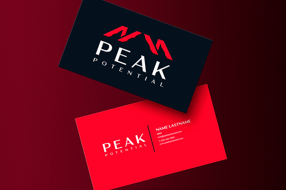

Peak Potential represents the journey from business ambition to measurable growth.
bottom of page